

Dining Room Makeover
This post has been sponsored but all opinions and color choices are my own. Thank you for learning about the brands I personally use and love!
I love a good room makeover! And while this room wasn’t too bad before, I envisioned a space with more character and warmth. So I decided it was time for a little makeover! My goal in this room was to add character and create a space that makes people feel calm and comfortable as they enjoy conversation, food, and laughter here in the dining room.
When redoing a room, one of my first decisions always involves paint. Colors influence the mood of a room and often inspire other elements in the design too.
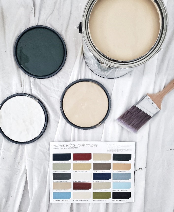
So I turned to HGTV® HOME by Sherwin-Williams Color Collections to find a beautiful coordinating combination of paint colors to use in the dining room. One of the frustrations that I’ve heard people express is that they want their home to look beautiful but they struggle to pull things together to create a space that looks like the ones they admire in photos. So I thought it would be fun to show you how the Color Collections eliminate the guesswork so that you can confidently create a room you will love!
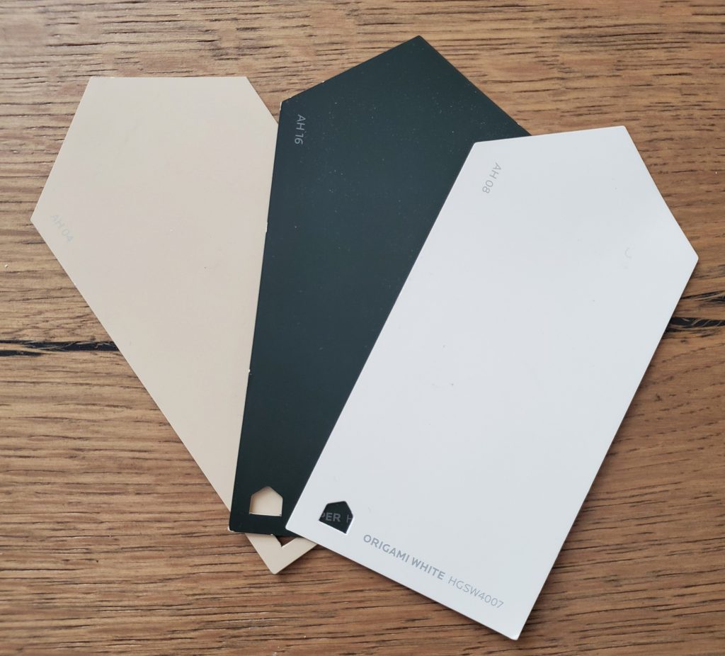
I selected Jasper (HGSW3291), Nomadic Desert (HGSW3146), and Origami White (HGSW4007), which are all from the American Heritage Color Collection from HGTV® HOME by Sherwin-Williams, exclusively at Lowe’s. Since these 3 paint colors are all from the same Color Collection, I know they will give this dining room a designer-inspired look in the end! If you are someone who struggles to choose the right colors, you definitely need to consider these Color Collections because designers have already done the work for you by curating these color palettes.
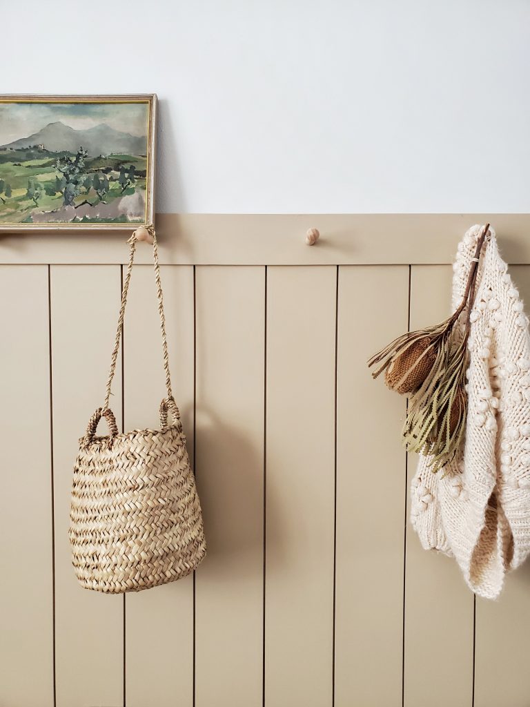
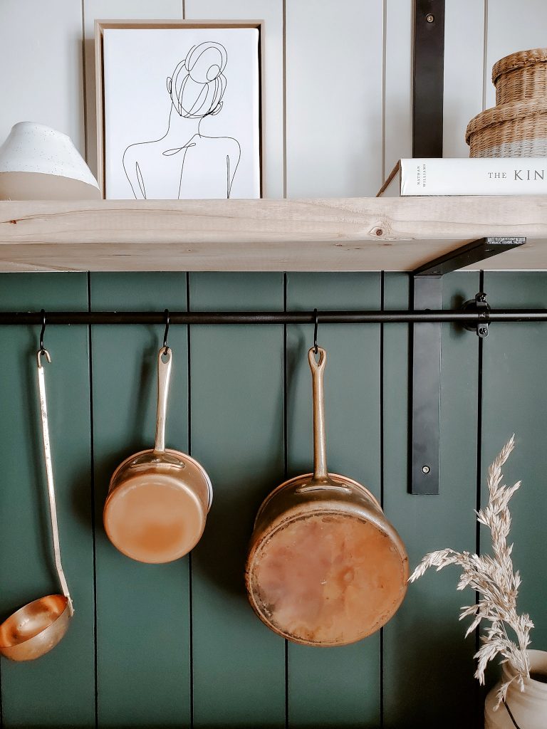
This basic wall in our dining room had no style or function, and it was definitely time to change that!
BEFORE:
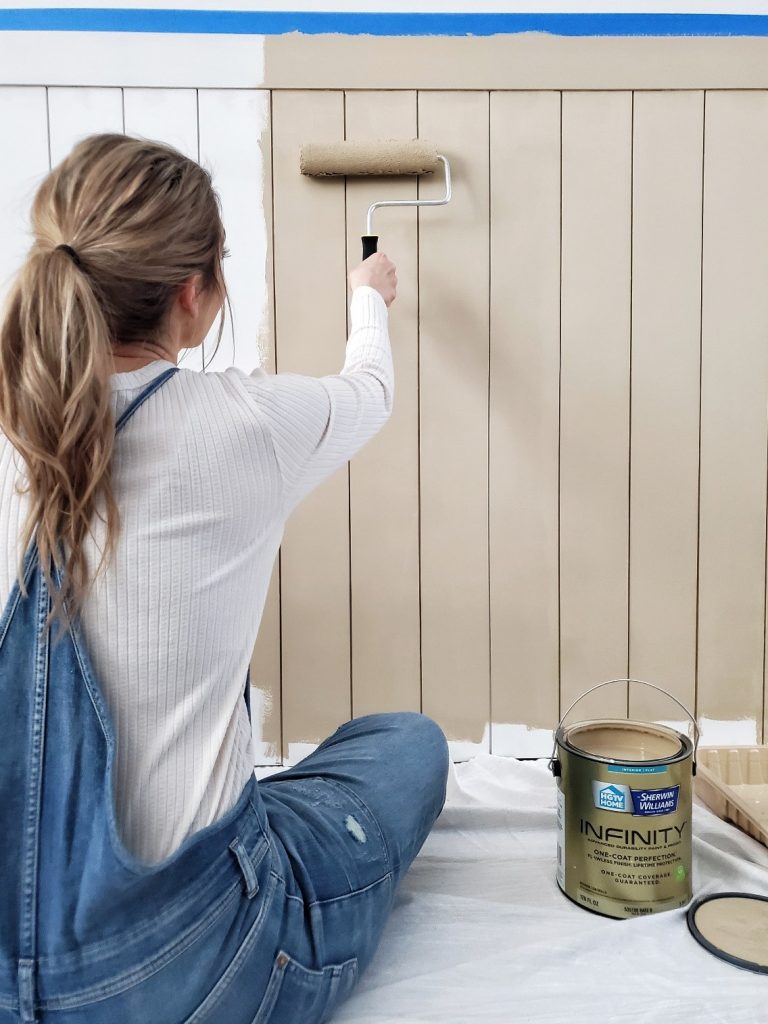
Using Nomadic Desert in a flat finish added the warmth that this room was lacking. By painting the peg rack wall in this neutral warm tone, I created the timeless look I was aiming for.
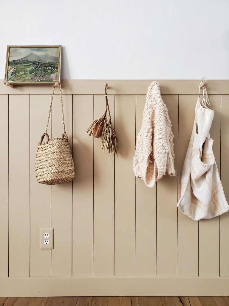
AFTER:
With the help of paint and some pegs, I took this bland wall and created a beautiful and functional space that can be used to display pretty things, as well as offering extra storage for coats and hats.
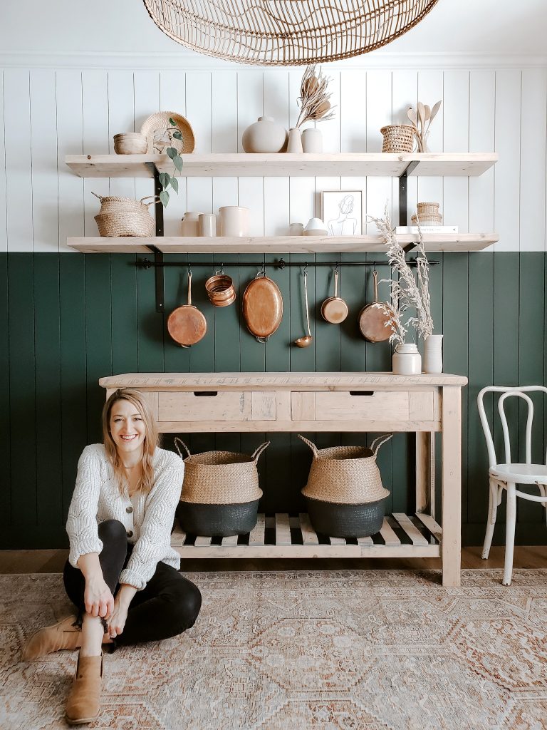
And I chose this vintage artwork as decor for this space because the green tones are reminiscent of the other walls in this room. By staying consistent with this color palette throughout the decor, it helps create a more cohesive room in the end!
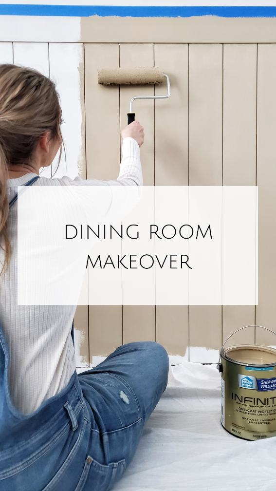
To create my signature high-contrast design, I chose to pair Jasper and Origami White.
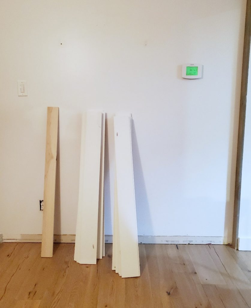
Time to tackle the rest of the room!
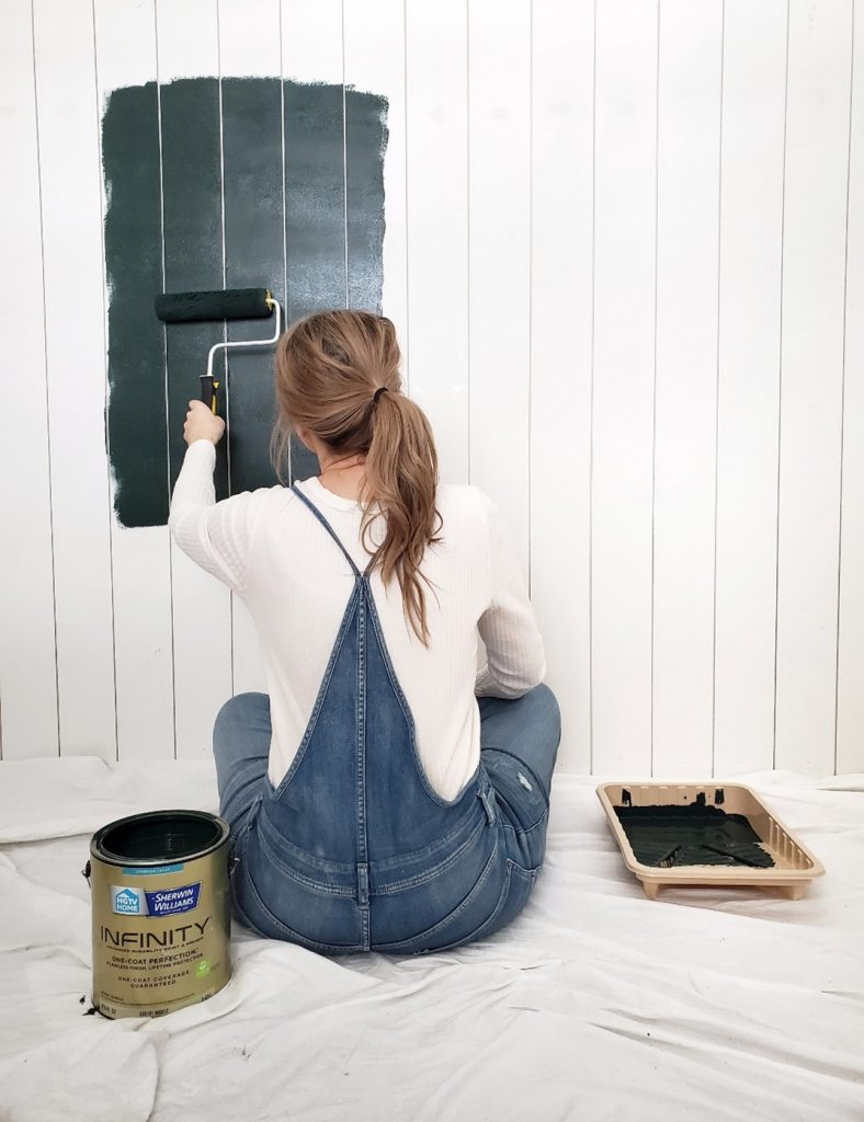
By colorblocking one wall, it creates a statement focal point in the room, and I couldn’t love it more.
And since these colors are from the same Color Collection (American Heritage), I can paint with confidence, knowing they complement each other well.
A few tips for colorblocking a wall:
Generally speaking, the 2/3 and 1/3 split is a very visually appealing option. Measure from floor-to-ceiling in inches, then divide by 3. Take the number and measure that distance down from your ceiling. That is where your line will be! You can snap a chalk line, or you can make multiple measurements and use a level to make sure your line is definitely nice and level. And let me tell you my secret trick for this next part of the process: After applying painters tape, get a credit card and run it along your tape line to really seal that tape so that you get a crisp paint line every single time.
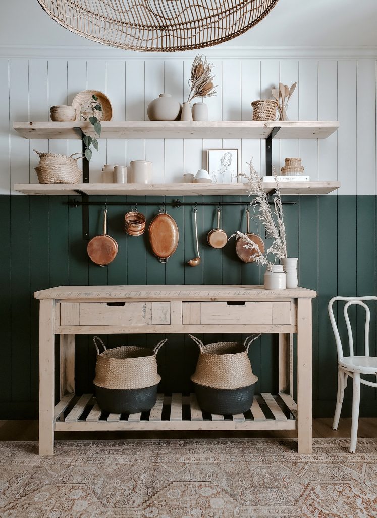
In the end, I couldn’t be more thrilled with the outcome! I’m always impressed by the difference that some paint and a wall treatment can make in a space. This dining room now has the overall mood and character that I was craving, and I couldn’t be happier with the outcome.
Leave a Reply


READY TO GROW YOUR INSTAGRAM AUTHENTICALLY?
I’m sharing the top 5 mistakes you’re making that are hurting your IG growth, and how you can solve them today!
GRAB MY FIVE TOP TIPS
WANTING TO MAKE YOUR SPACE MORE JOYFUL AND YOU?
There are three easy things I love to do to make my spaces full of joy and personality
DOWNLOAD THE GUIDE
FAVORITE POSTS:
Sometimes toys come along that are so fun, interactive and unique that you just have to have one. The new Little Live Pets My Puppy’s Home by Moose Toys is one of those! So we decided to surprise Bean with one. Have you heard about this toy?! It’s an interactive DIY toy that comes with […]
READ POST
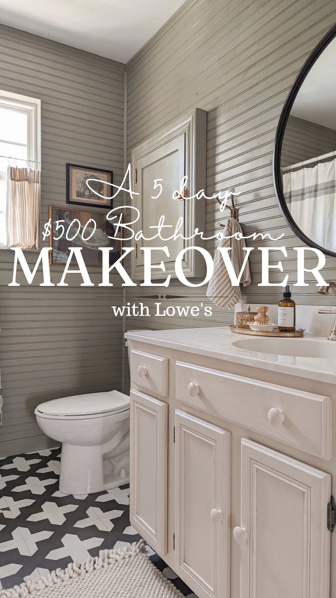
I was determined to give my bathroom a refresh for only $500 in just 5 days! I headed to Lowe’s for all the supplies because I knew I could find affordable products to complete the project. I selected beadboard planks as an easy and budget-friendly wall treatment, and choose Stainmaster paint in the colors Sweet […]
READ POST
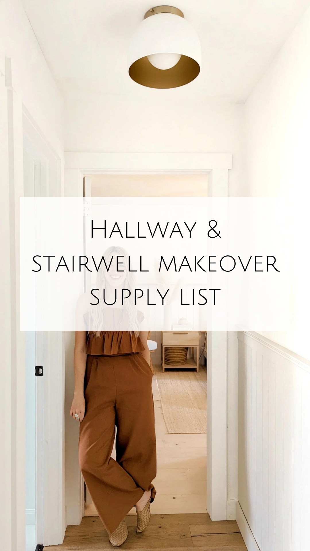
Here is a supply list of all the items I used in my stairwell and hall update if you would like to replicate it. Pine Bead Board: Top Trim: Decorative Moulding: Paint Colors: Bead Board: Sherwin Williams – Natural Cream in Eggshell Walls: Behr Scuff Defense – Polar Bear in Flat Railing Primer: Stix Primer […]
Love the way this turned out!! I recently painted my office a similar dark green color and have been looking for a rug to compliment it… any chance you can you link your rug? Thanks 🙂
Thank you! The rug is from Chris Loves Julia x Loloi Rugs. It is called Jules and it is the color tangerine!
You’ve inspired me! I think this will be my first project. The mud room wall. Will you be adding a step by step? Does the wall come up to just under your light switch?
Hi Kristen! I love that you are inspired by what I shared! I will be saving it to my story highlights on Instagram and I am also starting a blog post.
I’m dying to see it all together!!! Such a beautiful transformation!
Thank you! I am so happy with how this space came together!
Amazing! Looks great, the colors so compliment each other. And your styling sets everything off. Super Job! Happy New Year!
Thank you! That is the beauty of selecting from the HGTV Home Color collections. They are all meant to work well together!!
Can you link the brackets you used for the shelves? Thanks!
Hi! I do not have the specific link because I bought them in store at Lowe’s. If you search black metal brackets, they should be there.
Love love love this! What a difference! The colors are so perfect too!
Thank you! I am really in love with the Jasper. It really is such a rich, deep color!
Love the way you look at your reality. Your positive outlook in doing things with real people in mind. We are all not rich and you provide that enthusiasm that we need to feel we can do.
Thank you
You’re welcome! I am so glad you appreciate the approach I take when redoing our home!